One variant of the chart included a marker that represented how many cars were unclassified at the end of the race, but as a whole the chart was very unsatisfactory in the way it depicted this information. It was all but impossible to tell which car was in last position for example.
So here's an improved version of the chart, with a line graying out the unclassified positions. The + mark also identifies the last position in the race, so now it should be possible to identify how close to the back of the field each driver finished... (the circle highlights the grid position):
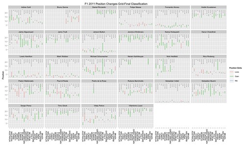
Here's the code fragment extending the code in the previous post that generates the plot:
ggplot(raceResults2011) + geom_linerange(aes(x=race,ymin=24-missing,ymax=24),colour='gray50') + geom_point(aes(x=race,y=24-missing),colour='gray50',size=1,shape=3) + geom_linerange(aes(ymin=grid,ymax=pos,x=race,group=driverName,color=factor(pchange>0,labels=c("Loss","Gain"))),size=0.6) + facet_wrap(~driverName)+geom_point(aes(x=race,y=grid),col="gray50",size=1) + opts(title="F1 2011 Position Changes Grid-Final Classification",axis.text.x=theme_text(angle=-90))+xlab(NULL)+ylab("Position") + scale_colour_discrete(name="Position Delta")
I also increased the thickness of the position change line by a small amount to make it a little more noticeable. (Note that the chart may be even clearer if we add in a marker highlighting the final classification, as in the chart below; this should do the trick: geom_point(aes(x=race,y=pos),colour='gray50',size=1,shape=2) )
Another view over the data can be generated with a couple of minor tweaks to the R expression above, recasting the chart so that results are displayed by race:
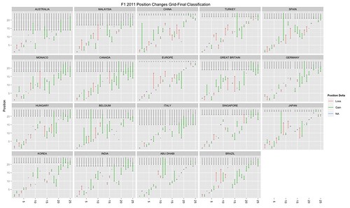
I use car number on the x axis because the drivers across races were not consistent. I also added in a marker to highlight the final classified position (using geom_point(aes(x=driverNum,y=pos),colour='gray50',size=1,shape=2)), in order to distinguish those cars that started and finished a race in the same position.
HEre's the modified R code:
ggplot(raceResults2011) + geom_linerange(aes(x=driverNum,ymin=24-missing,ymax=24),colour='gray50') + geom_point(aes(x=driverNum,y=24-missing),colour='gray50',size=1,shape=3) + geom_point(aes(x=driverNum,y=pos),colour='gray50',size=1,shape=2) + geom_linerange(aes(ymin=grid,ymax=pos,x=driverNum,group=driverName,color=factor(pchange>0,labels=c("Loss","Gain"))),size=0.6) + facet_wrap(~race)+geom_point(aes(x=driverNum,y=grid),col="gray50",size=1) + opts(title="F1 2011 Position Changes Grid-Final Classification",axis.text.x=theme_text(angle=-90))+xlab(NULL)+ylab("Position") + scale_colour_discrete(name="Position Delta")
PS Hmm... it strikes me that for the view by race chart, a horizontal line would serve better to identify the final position cut off point?
ie remove both:
geom_linerange(aes(x=driverNum,ymin=24-missing,ymax=24),colour='gray50')
which puts the uncliassified positions grey line in, and:
geom_point(aes(x=driverNum,y=24-missing),colour='gray50',size=1,shape=3)
which adds the last classified position maker, and replace them with:
geom_hline(aes(yintercept=24-missing),size=0.5,colour="gray80")
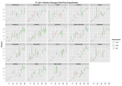
The plotting command is thus:
ggplot(raceResults2011) + geom_hline(aes(yintercept=24-missing),size=0.5,colour="gray80") + geom_linerange(aes(ymin=grid,ymax=pos,x=driverNum,group=driverName,color=factor(pchange>0,labels=c("Loss","Gain"))),size=0.6) + facet_wrap(~race)+geom_point(aes(x=driverNum,y=grid),col="gray50",size=1) + opts(title="F1 2011 Position Changes Grid-Final Classification",axis.text.x=theme_text(angle=-90))+xlab(NULL)+ylab("Position") + scale_colour_discrete(name="Position Delta")
It gives a much cleaner graphic, I think?
PS Bah... wrong function, wrong chart - I missed off the final position marker; function should be:
ggplot(raceResults2011) + geom_hline(aes(yintercept=24-missing),size=0.5,colour="gray80") + geom_linerange(aes(ymin=grid,ymax=pos,x=driverNum,group=driverName,color=factor(pchange>0,labels=c("Loss","Gain"))),size=0.6) + facet_wrap(~race)+geom_point(aes(x=driverNum,y=grid),col="gray50",size=1) +
geom_point(aes(x=driverNum,y=pos),colour='gray50',size=1,shape=2) + opts(title="F1 2011 Position Changes Grid-Final Classification",axis.text.x=theme_text(angle=-90))+xlab(NULL)+ylab("Position") + scale_colour_discrete(name="Position Delta")
No comments:
Post a Comment
There seem to be a few issues with posting comments. I think you need to preview your comment before you can submit it... Any problems, send me a message on twitter: @psychemedia