With just four or five memu selections, it's easy enough to generate lattice displays such as the following:
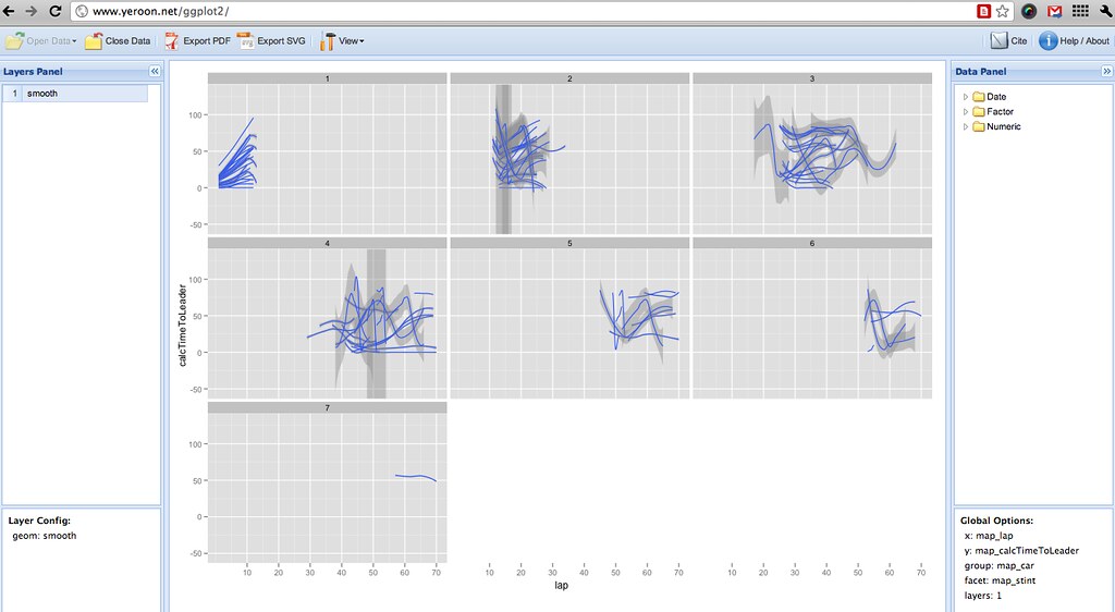
This shows the time-to-leader (in seconds) for each car, by stint relative to each car. Whilst it's not obvious from the chart which car is which, exactly, this view does give us the opportunity as analysts to look for interesting features. So for example, at a glance we can see the winning car had 3 stops (4 stints), most cars did a similar length first stint, one car went long in stint 2, from the stint 3 panel we see one car went short in stint 2, and one stayed out quite long in race-lap terms in stint 3, one car stopped (or at least, went through the pits) 6 times.
Here's the code the menu selections generated:
ggplot(myData, aes(x=lap, y=calcTimeToLeader, group=car)) + geom_smooth(fill="#C0C0C0") + facet_wrap(~stint)
So - useful or not? Interesting approach or not?
*Jeroen C.L. Ooms (2010). yeroon.net/ggplot2: A web interface for the R package ggplot2.
Version 0.2. http://www.yeroon.net/ggplot2
H. Wickham. ggplot2: elegant graphics for data analysis. Springer New York, 2009.
PS a couple of others - a view over the different race positions held by each car - maybe we could use this to signal whether a driver had a particular;y up-and-down sort of day?
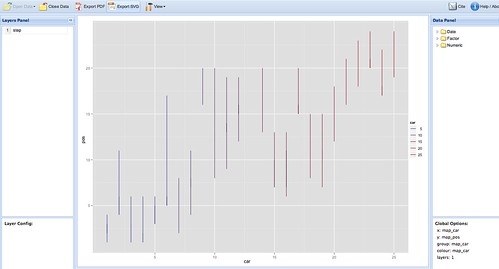
Code: ggplot(myData, aes(x=car, y=pos, group=car, colour=car)) + geom_step()
Here's a chart that summarises (in crude terms) when position changes were occurring through the race:
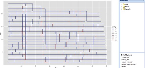
ggplot(myData, aes(x=lap, y=pos, group=car, colour=pitstop)) + geom_step()
Trivially, we can generate indiviual plots showing the position of each car across laps:
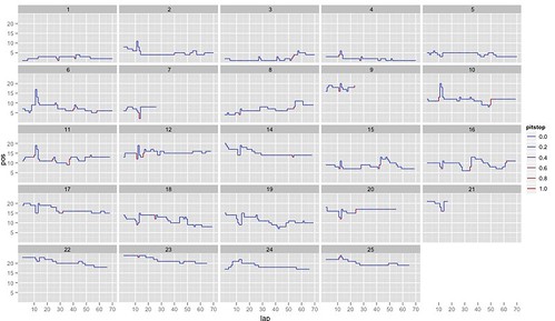
ggplot(myData, aes(x=lap, y=pos, group=car, colour=pitstop)) + geom_step() + facet_wrap(~car)>
And here's a view over fuel corrected laptimes (unfortunately, the scale doesn't let us see the difference between the two dry tyres...)
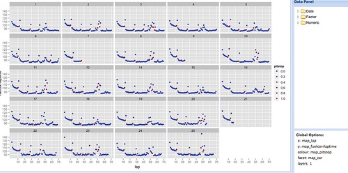
ggplot(myData, aes(x=lap, y=fuelcorrlaptime, colour=pitstop)) + geom_point() + facet_wrap(~car)
PPS a slightly tidier image:
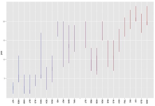
ggplot(h, aes(x=car, y=pos, group=car, colour=car)) + geom_step()+scale_x_discrete(limits =c('VET','WEB','HAM','BUT','ALO','MAS','SCH','ROS','HEI','PET','BAR','MAL','','SUT','RES','KOB','PER','BUE','ALG','KOV','TRU','RIC','LIU','GLO','AMB'))+xlab(NULL)+opts(axis.text.x=theme_text(angle=-90, hjust=0))
Just need to drop the legend on the original image and add a title now?
ANother PS...
If we bring in the final classification data, (and remove the DNF positions), we can put a point on the chart showing the final position:
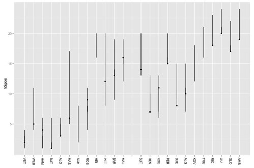
h=hun_2011proximity
k=hun_2011racestatsx
ggplot() + geom_step(aes(x=h$car, y=h$pos, group=h$car))+scale_x_discrete(limits =c('VET','WEB','HAM','BUT','ALO','MAS','SCH','ROS','HEI','PET','BAR','MAL','','SUT','RES','KOB','PER','BUE','ALG','KOV','TRU','RIC','LIU','GLO','AMB'))+xlab(NULL)+opts(axis.text.x=theme_text(angle=-90, hjust=0))+geom_point(aes(x=k$driverNum, y=k$classification))
Add in the grid position as a red dot:
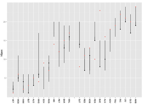
Blimey! Is my data right?
ggplot() + geom_step(aes(x=h$car, y=h$pos, group=h$car))+scale_x_discrete(limits =c('VET','WEB','HAM','BUT','ALO','MAS','SCH','ROS','HEI','PET','BAR','MAL','','SUT','RES','KOB','PER','BUE','ALG','KOV','TRU','RIC','LIU','GLO','AMB'))+xlab(NULL)+opts(axis.text.x=theme_text(angle=-90, hjust=0))+geom_point(aes(x=k$driverNum, y=k$classification))+geom_point(aes(x=k$driverNum, y=k$grid,col='red'))
How about we now add in a horizontal tick to mark the position at the end of the first lap:
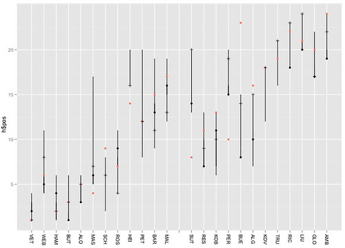
l=subset(h,lap==1)
ggplot() + geom_step(aes(x=h$car, y=h$pos, group=h$car))+scale_x_discrete(limits =c('VET','WEB','HAM','BUT','ALO','MAS','SCH','ROS','HEI','PET','BAR','MAL','','SUT','RES','KOB','PER','BUE','ALG','KOV','TRU','RIC','LIU','GLO','AMB'))+xlab(NULL)+opts(axis.text.x=theme_text(angle=-90, hjust=0))+geom_point(aes(x=k$driverNum, y=k$classification))+geom_point(aes(x=k$driverNum, y=k$grid,col='red')) +geom_point(aes(x=l$car, y=l$pos,pch=3))
(Maybe a bit clearer if we switch the grid and lap 1 layers so red grid pos above the tick mark where they are coincident?)
No comments:
Post a Comment
There seem to be a few issues with posting comments. I think you need to preview your comment before you can submit it... Any problems, send me a message on twitter: @psychemedia